


Let's take a quick break from the Hot Stove--we have an ice storm here, and I am stuck at home. In a moment of sheer boredom I grabbed a stack of old baseball cards to look at over a cup of coffee.
Now we all love our Mets--that is a certainty--but I need to ask: Has one team ever been beset with more bad baseball card depictions?
Here is a typical Mets baseball card from the 70s:
It looks like a designer went to the studio and asked, "what are the two worst colors we could use for the Mets? I got it! Let's use crap brown and piss yellow. The best part is they have nothing to do with the Mets."
OK, he was rolling...and now came his moment of inspiration.
"Hey guys, let's do something totally unique on this one and use no effort or creativity while doing so. What about using an aluminum bat with electric tape on the handle? Yes, the one laying there next to the real bats--use that one. Then we'll put some crappy machinery in the background and position the player so we get a full view of thousands of empty seats."
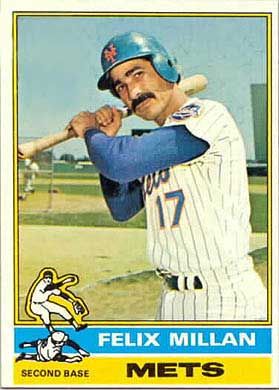
So this is what we get--crap--and as I peruse some great Mets cards of the past we see this lack of inspiration over and over again (Felix Millan anyone? This card cracks me up.). Even when the Met isn't the featured player on the card they seem to get the short end of the stick (so to speak).
Do you think Joel Youngblood ever fully recovered from this?
OK my friends, let me hear some more Mets baseball card horror stories.
If you can top Joel Youngblood getting a Tim Foli mustache ride, you'll get a prize.
![Reblog this post [with Zemanta]](http://img.zemanta.com/reblog_e.png?x-id=7a11efd8-8ac0-4289-af83-509b25760020)


2 comments:
LoL!! His mustache is as cool as Keith's. Although I just noticed my dads friend has a killer 'stache like that.
I think Foli had the original porn 'stache.
Post a Comment